Just before Super Tuesday, I wrote about the influence of fonts on our choices – even our choice of Presidential candidates. An analysis of the logos of the candidates in both parties correctly predicted the success of Barack Obama and John McCain. It may not have been written in the stars, but the handwriting – in their fonts of choice – certainly was on the wall for those who did not win.
It will be interesting to see if either one of the candidates makes any changes to their logos as we move into the general election campaign.
Impressions of the candidates based on their logos (from the Font Bureau’s analysis) suggest the enormity of the choice we face as a nation:
Obama: “contemporary, fresh, very polished and professional… the feeling of a hot new Internet company...This typography is young and cool. Clearly not the old standards of years past. “
McCain: "in between, moderate, not too far in either direction...Everything about this logo says you can buy a car from this man. From the perfectly centered star to the perfectly spaced type, the entire design looks like a high-end real estate company.”
As I always say, "fonts have feelings." You want those feelings to be the right ones, whether you're running for President or celebrating a bar/bat mitzvah. So keep this in mind when you're designing invitations for your special occasions.
When you've got your invitation just right, be sure to let Purple Raincoat preserve your memories with a personalized keepsake. We would love the opportunity to create something wonderful with an invitation to the 2009 Presidential Inaugural Ball...so stay tuned.
Of course, there are plenty of occasions to celebrate besides an inauguration. Birthdays, anniversaries, new babies...you get the idea. When you're celebrating, give Purple Raincoat a call so we can create a wonderful framed keepsake just for you.
In the meantime, congratulations to the winning Democratic and Republican candidates. The nominees are in place and the stage has been set – let the wild rumpus start!
Wednesday, June 4, 2008
The type is right


Friday, April 4, 2008
Can a font make you lose your appetite?
A cautionary tale about menus (and invitations)
I believe that “fonts have feelings” – their emotional impact can drive you to make choices on a level that you may not even be aware of. In my February 4 post, I talked about an article analyzing the potential impact of fonts on how voters make their choices for presidential candidates. Well, that article was correct in its prediction that John McCain would be the Republican nominee. Time will tell if the article was right about Barack Obama winning the Democratic nomination.
A few days ago, a Boston Globe restaurant review started by wondering why so few of the people who looked at the posted menu actually came into the restaurant. Here is an excerpt from the review by James Reed (March 29, 2008) – I’m hiding the name of the restaurant (they’ve got enough problems):
“Twenty-seven. That's an awful lot of people we watched as they considered dinner at (the restaurant) and then quickly moved on down the street. It was a recent Saturday night, during the prime dinner hours between 7 and 9 p.m., and one by one, would-be diners lingered over the menu posted outside and kept walking…Eventually, though, we figured out why people kept strolling by. Let's start with the typography on the restaurant's sign. It sounds silly, even ridiculous, I know, but (the restaurant) suffers from what one of us keenly described as "hair-salon font." It's true: The slanted, curly-cue script, which extends to the menu, makes it hard to decipher even a simple word like "agnolotti." © Copyright 2008 The New York Times Company
The evening that the review was published, I started reading Much Ado About Jessie Kaplan by Paula Marantz Cohen. My husband’s sisters, Ellen and Laura, recommended this book to me as “light reading.” They never mentioned what the book was about, so it was much to my surprise that I discovered it began with Carla, the main character, fighting with her daughter, Stephanie, about selecting an invitation for Stephanie’s upcoming bat mitzvah.
Carla was unprepared for the confrontation. From Chapter One: “Carla hadn’t thought that picking out an invitation would be so complicated. After all, how hard could it be to choose a good paper stock with a colored border and some curly type?”
Sounds as if Carla was talking about the same kind of “hair salon” font that the restaurant chose for its menu. I think the reviewer was right – in addition to being hard to read, the "curly-cue" font sends the wrong message about the restaurant’s personality.
The first moral of this story? Pay attention to the message you’re trying to communicate when you select a font for anything. The same font that works for a bat mitzvah invitation may not work so well on an upscale Italian restaurant menu.
The second moral? Be prepared for the amount of emotion that gets invested in the invitation selection process. Again, from Chapter One of Much Ado About Jessie Kaplan: "The many trivial, hard-to-differentiate variables involved in picking out a bat mitzvah invitation were just the sort of thing liable to cause a meltdown." All the more reason to showcase the "winning" bar/bat mitzvah invitation with a framed Purple Raincoat collage - a great gift for the bar mitzvah boy or bat mitzvah girl as well as a wonderful keepsake for the parents. To get ready, you may want to start checking out the wide selection of invitations available online - eInvite, Purple Raincoat's online invitation partner, is a great place to begin.
The third moral? Get your hands on a copy of this book if you’re anywhere near the bar/bat mitzvah years. The story of how bar/bat mitzvah planning can take on a life of its own will resonate with you and make you smile – sometimes with laughter, sometimes in painful recognition of your own experience. I’m not done with the book, but in addition to choosing an invitation it has already covered the joys of building the guest list, selecting a caterer, developing a menu, hiring entertainment, and designing centerpieces – all done within the context of a community where “keeping up with the Joneses” can drive a family way over its budget. The book is a selection of the Hadassah Book Club, and includes a reading group guide. This would be a fun one to discuss over coffee – or better yet, a glass of wine. Happy reading!
Thursday, February 28, 2008
Calligrapher to the stars – now available to you
The question of how to address invitation envelopes came up often when I was an invitation dealer. I told my clients they had several options:
• Address the invitations yourself by hand or using a computer. This generally is the least expensive option.
• Order invitations from a company that will deliver them with the guest addresses already printed on the envelopes – not the least expensive but probably the most very convenient.
• Hire a calligrapher, which is generally the most expensive option.
For my daughter’s bat mitzvah I considered yet another option (otherwise known as "a crazy idea"): learning calligraphy so I could address them myself. A friend who is an accomplished calligrapher assured me that it was a matter of tools and techniques that I could learn despite the fact that I have terrible handwriting. So I took a class and learned that there are some skills best left to the professionals. I gained a new respect for calligraphers, and began to evaluate the options for our own event.
This collage features my daughter's bat mitzvah invitation. I drew my inspiration from the orchid ink and the beautiful marble envelope lining, rich with shades of purple and gold. The linings from two envelopes were pieced together to create the first layer under the invitation.
Fortunately, we had ordered a Checkerboard invitation, and Checkerboard was just introducing its “EasyAddressing “envelope addressing service. I didn’t want to recommend this to my clients without proof that it worked, so I used myself as the guinea pig. Following instructions, I submitted the list online and waited for the invitations. I speak from experience when I tell you that it was fabulous to have the invitations arrive all addressed and ready to go.
Checkerboard offers more than 600 fonts, and you can use any of them for your guest addresses. So it offers one of the advantages of calligraphy – having your envelopes addressed in a beautiful font (whether or not it matches the font used on your invitation).
Now Checkerboard is making the advantages of calligraphy more widely available – and not just for addressing the invitations. They have a gorgeous new line of invitations created by world-famous calligrapher Maria Thomas. To create these spectacular invitations, “your names or monogram are personally penned by Maria Thomas to create a unique calligraphic piece of art. This hand-lettered art is combined with a custom font chosen by Maria to complete your design.” And of course, “matching motifs by Maria are available to embellish your envelopes.”
Wow. These are just jaw-droppingly beautiful. If you're in the market for a truly personalized wedding invitation, this is the place to go. And if you're on the receiving end of one of these invitations, you can be sure that turning it into a framed keepsake will be a unique gift that will be very much appreciated. Visit www.purpleraincoat.com and let us create something spectacular that will honor the invitation and be the perfect touchstone for memories of that special wedding day.
Maria’s bio notes that she has designed custom wedding invitations for the Trump family as well as for Michael Douglas and Catherine Zeta-Jones. So the same pen that creates invitations for celebrities is now available to create an invitation for you. How cool is that?
Monday, February 4, 2008
It's all about fonts, for a change
Will the presidential nominees be decided by their choice of font?
One of the most important thing I learned in my years of designing and selling invitations is that the choice of font contributes enormously to the emotional impact of an invitation. As I always told my clients, “fonts have feelings.”
Using a font that looks like a ransom note, for example, may be appropriate on a surprise birthday invitation but probably wouldn’t be right for a wedding or a retirement party. Fonts that are straight up feel different than slanting fonts - look at the difference between regular Georgia (that's the font used on this blog) and Georgia in italic, for example. Similarly, an invitation in a very formal and intricate script-type font will have a different feeling than the same invitation with a newspaper-type block font. 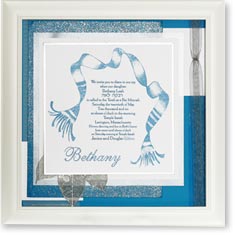
This invitation successfully combines a block and script font. See more samples of bat mitzvah invitations at www.purpleraincoat.com
So what does this have to do with the presidential election?
The emotional connection that people make with fonts undoubtedly was considered by each of the major candidates for the Democratic and Republican presidential nominations in designing the graphics for their campaigns. A few days ago, the Boston Globe published an analysis of the candidates' logos to see which fonts were more effective in promoting the idea of “change,” something that has been embraced by so many of the candidates as a central theme of their campaigns. This fascinating assessment, written by Sam Berlow and Cyrus Highsmith of The Font Bureau, highlights the subtle and not-so-subtle influence of the chosen fonts on how voters decide which candidate to support.
The presidential race is evolving so rapidly that several of the candidates mentioned in the article are no longer in the running. Who knows what impact the fonts in their logos had on their lack of success in winning the nomination?
So on the eve of Super Tuesday, I thought it would be interesting to pass along their article, which draws an interesting conclusion: “If we were to predict the results based on typography and design, we would pick McCain and Obama.”
By Wednesday morning, we will have a great deal more evidence of how accurate their analysis is.
If you’re in a state with a primary election tomorrow, don’t forget to vote! And if you’re still undecided, maybe this information will help you make your choice.
Looking for a unique gift? Turn to Purple Raincoat, where we are experts at creating the gifts that people will be talking about. Visit us at www.purpleraincoat.com to see what we can do for you.


 Posts
Posts

